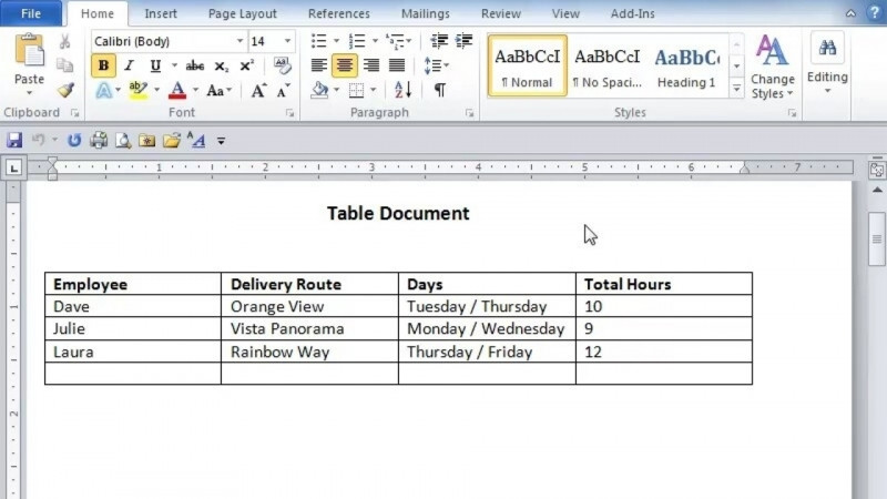
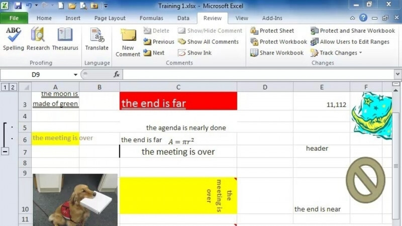
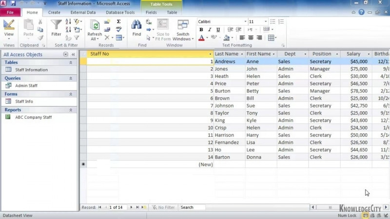
Hello, my name is Bob Ackbar and in these lessons, you will learn customizing tables and charts. In this lesson, we are going to learn creating charts and tables. There are two types of tables that users create. One is like this one, where it simply contains information. There is really nothing to compare. These are some made -up people. Please do not email anybody. These are not real emails. Then there are tables such as this one that actually have information that we would like to display in a easy -to -understand method. This is where we come to the Insert tab. You will notice we can insert charts and tables. Since we already have a table to start off with, we're going to use this table. Something that everybody notices is that Excel tries to be helpful, and it gives us some charts. There's clustered columns, line charts, pie charts, and clustered bars. Now, you can have them based on the orientation, the clustered columns or the clustered bars. Then there's a drop -down where we have many different choices now. You will notice that there's ones with the markers, there are the area charts, there's the scattered, and there's the other types. Everybody asks, they say, Bob, how do I know which one to use? Allow me to start by explaining to you that not all of your data is going to be presented at the same time in a single chart, especially when you have multiple complicated datasets. For example, you have employees and you have offices, and both of those can be graphed under sales, but not at the same time. Allow me to demonstrate what happens if you try to graph these at the same time. Now, you will notice that the employees have made sales in different offices. They don't necessarily have stayed in one. Now, if I simply go to the recommended charts, it is going to give me the sum of sales by employee. You notice the offices are not in there. Frequency of sales really doesn't tell us much. None of these are helpful. I did ask, is this helpful? Select what you want. If you want the employees, you'll notice even Excel is sensing here, it can't put the office employees and sales on one graph. There is no reason, rhyme, or rhythm to being able to do that. I like that, we can do that, or we can close this and we can select employees and sales, and we can create a recommended chart. I'm going to go with a pie chart, and there it is. It shows each person's contribution and how that fits in with the grand picture. Another way of doing this is we can go back to inserts, and let's go to all the chart types here. What if we used a stacked column? Now, you'll see that it has each one in there, and they can see what the performance looks like up to the price points. If we double -click on this chart, it will give us options as far as what we want, and if we want the data table included. Once we have the data table included, you can see that it has the numbers in there of how much each person's sale was. Next, if we just simply do an employee and their commission, it will give us the same data insert, and we can do the different graphs, and there's the commissions out of total, and we can match them up with the colors. We can also double -click on the chart, as legends, the series, and the data labels, which we can put in there, and it'll tell us what it is on each one in there. What is important when we are creating our tables, is to say what information do we want included in these tables. The simpler the table is, the better it is, and that's why we have what we created our table here, which just has the employee information. We can even add another column here for their phone number, and this is not related to the table that has the sales data in there, and we've used the reference to bring the employees over to our sales table from the employee table. So the first rule when you're creating tables, always assume there is going to be a reason for you to create a chart later on, and what is the minimum number of data that you can put in a table that will give you data points, so you can select two columns, for example, employee and commission, and generate some kind of a chart or a graph that will show visually in an easy -to -understand manner for your target audience to understand a summary of the data that you are trying to portray. Second, if there is a table that is not related to anything of value to be graphed or presented, or because of privacy reasons or proprietary company information, it is not something that you want displayed to everybody, that's when you use separate tables, and you will notice we have a worksheet that says employees, and if we wanted to, we could create another one for charts, and this way, we can separate the information, so if we got employees, and we got their sales, and we create a chart, we can copy this or cut this, go to the charts, and insert it into there. That way, when we have a presentation, our information is displayed without the proprietary information or private information that should not be there. Stay tuned for the next lesson, where we'll talk about customizing tables. Thanks for watching.