Enjoying the preview?
This is the free first lesson. Get full access — request a demo or sign in.
Enjoying the preview?
This is the free first lesson. Get full access — request a demo or sign in.
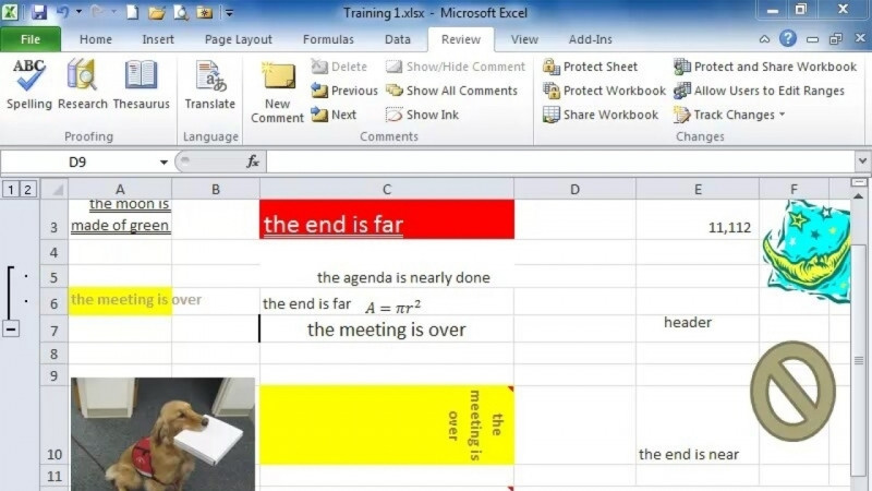
Most users want to present data findings in a visual way that is easy to understand. For this reason, charts, plots, pictures and shapes are useful. In this Excel course, we’ll explore powerful tools for beginner users to present their data.
When using charts, the data is related on both axes. When using plots, we are showing points that may not be related to a dependent variable. Both of these methods provide visual displays. There are effective methods for testing different previews to see which type of display provides the best representation of your data set. Charts and plots can be customized with extensive details to provide all the tools necessary for professional presentations. Finally, the ability to use pictures and shapes can add richness and clarity to your presentations. You will learn how to draw an audience’s attention to specific areas of your data tables and make ideas stand out.
It is an Excel course designed for beginner users who want to present their data visually in Microsoft 365 Excel (2023).
It covers charts (in two parts), plots, and pictures and shapes, including Excel graphics options and layering.
Charts relate the data on both axes, while plots show points that may not be related to a dependent variable; both provide visual displays.
You will build skills in Microsoft Excel, spreadsheets, data visualization, graphical tools, pivot tables and charts, and visualization.
It is organized into four lessons: Charts (Part 1), Charts (Part 2), Plots, and Pictures and Shapes.