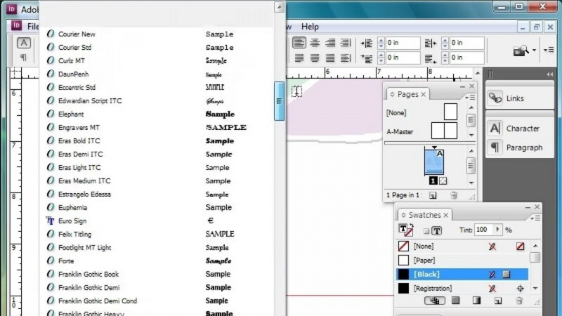
In this lesson, you will learn about character formatting in Adobe InDesign. I have the Character Formatting Recap file open from the lessons folder in the chapter three folder. I also have the advanced workspace as my workspace. If you don't see your panels in the same place that I have mine. You can go to the Window menu to Workspace and choose the Advanced workspace. Now, in this lesson, we're going to talk about some of the basic character formatting options that we have such as font, size, color, and tracking. We're going to zoom in on our font section. So we're going to go to the View menu to Zoom in just a couple of times. And we're going to go over to our scroll bar on the right, so that we can see our font section. Now the first thing we're going to talk about are some of the fonts that we have available to us in InDesign, in our font column. The first paragraph says Sans Serif Font. So we're going to click and drag to select all of the text in that paragraph. We're going to go to our control panel up across the top, and we're going to make sure that we have the letter A selected. That means that it is going to show us our character formatting controls. And one of the first things that we look at with our character formatting controls is our font family. We have the Minion Pro font. It is the default font for Adobe InDesign, but we're going to click on that drop down menu just to the right of Minion Pro. And we have a whole list of fonts available to us now in order to find the type of font that you want, we're going to go into the filter drop down just to the top here. And I'm going to click on this Clear All button. So what that's going to show me is all of the fonts that are available to me. Well, if I want to specifically have a certain type of font, I can go back into that classification area. And it shows me the different types of classifications. The first icon in the top left is the Sans Serif typeface Sans Serif means without Serif. So there are no little lines at the of our letters. So I'm going to click off of that. And so now I have a list of all of the Sans Serif typefaces that are available to me, either on my computer, or if there is a cloud icon over on the right, it means that is one of the Adobe fonts that I have added my creative cloud. If you are unfamiliar with the Adobe Creative Cloud Fonts. You can go to the InDesign basic lessons, and there is a lesson about how to add fonts to your Adobe InDesign. If you look at a font and you see a number in parentheses just to the right of the font, it means that is the number of styles that that font has. So I have Avenir as a font and I have 12 in parenthesis. If I click on the arrow just to the left of Avenir it will show me all of the different styles that I have for that font. So I can choose one of those styles. So you can choose any Sans Serif typeface for your paragraph. We're going to go to the second paragraph. And we're going to select all of that text. Now it's especially important when you are applying character formatting that you have all of the characters selected that you want to apply that format too. So with that whole paragraph selected, I'm going to go up to my font drop-down menu again, I'm going to click on that drop down menu. I'm gonna change my filter. So I'm going to click on that drop down for the filter. And I'm just gonna click once on that Sans Serif And that will de-select that as a classification, I'm going to go to the second icon in which is the Serif. And again, InDesign shows me all of the different Serif font options that I have. And again similar to what we saw with the Sans Serif typefaces. If you see a number in parentheses, it means that that's how many So again, we're going to choose a Serif typeface, and you can choose any one of the Serif typefaces that you have. Now, the last type of font we're going to talk about is a Decorative font. And if we select this whole paragraph, we can go up to the top, and once again, we're going to go into that classification area. And we have many different types of fonts that could classify as decorative fonts. We have a whole section of decorative, but then we have handwritten fonts. We have Black Letter or Gothic script fonts, and we have script that are Flowing or Calligraphic. So you can choose any one of these options and just click on that and then choose a font from in that section, each one of the fonts that we chose just now we did by clicking on that drop down menu. Another way that you can choose a font, we're going to go back up to this first paragraph. And I know that I don't want Avenir. So I'm going to click on the dropdown menu and I'm going to clear all because I don't want to filter for my decorative anymore. And I'm going to select that Avenir and type in AUX. And when I do it shows me that I have a font called Aaux Next. And so it's going to show me that font. So I'm going to just choose from here. So in addition to using that dropdown, you can also type in the name of the font if you know it. So those are some of the formatting options for your fonts. Now the next section that we're going to talk about is size. I'm going to leave the size of my first paragraph, what it is. It's 12 points, which is our default font size, but I'm going to go down to the word Headline right after that font. And I want to make this a little bit larger so that people know that it's a headline. I can go just to the right of where we found our font families. And this is where we find our font size, and I can choose a larger font size. Now, maybe 18 points isn't large enough, and I want it a little bit larger. So now I can use the up and down arrows just to the left of that font size. And I can increase my font size that way. I have another headline down here. And if I select that, and I know that I want 20 points, I can go up and just select that number 12 and type 20 over it and hit the Enter key. And that's another way that I can change the size of my font. Color is another characteristic that we change for our type. So we're going to select our first paragraph under color. And again, we're going back up to that control panel. And if we go a little bit over to the right, we see a big letter T and if we click on the arrow just to the right of that, it opens up our Swatches panel and we can apply any one of these colors. I'm just going to choose this red color to our text, right from that control panel, I'm going to select the second paragraph. And this time I'm going to go over to my Swatches panel because from the Swatches panel, we can also choose our color. You do have to be careful when you choose a color from the Swatches panel, you want to make sure that the fill color for our type is in the front up here in this top left corner, where we have the letter T, we want to make sure that we have our fill color selected. And so this time I'm just going to click on this blue color down here at the bottom. So those are a couple of different ways that you can apply color to your text in InDesign. Now the last formatting option that we're going to talk about is a feature called Tracking. Tracking is the amount of space in between the letters in your words. When we talk about tracking, we refer to tracking as either tightly tracked, normally tracked or loosely tracked. And so, as you can see we have three paragraphs that have those words at the beginning of the paragraph. So we're going to select the Tightly Tracked paragraph. And we're going to go up to our control panel here along this bottom row. This is where we have the tracking feature. And if we click on the dropdown, just to the right of that, we can see that we have some negative numbers in here. Now, when we track our type in negative numbers, our letters get closer together. A lot of times people will use this feature to help fit their text into a certain area. You have to be very careful. You don't want to too tightly track your text, because if you make it too close together, as you can see, it becomes difficult to read. When we select our normal track, you can see that has a zero next to it. So all of the spacing is what is built in from the font. I'm gonna scroll down a little bit further, and I'm going to go down to the loosely tracked text. Now this time, I'm going to put a positive number in here. I'm going to go all the way up to 200, because kind of similar to when we too tightly track our text. If we too loosely track our text, then it becomes hard to read because all of our letters are far apart. So I'm going to select that again. And I'm going to add just about 25. So it spreads my letters out a little bit more, but not too bad. So that's loosely tracked text. And so both of the tightly tracking and loosely tracking our type can help us fit our text a little bit better into the areas that we need. But another thing with tracking, I want you to be aware of. You can see how those three paragraphs in this last column look a little bit odd. So you want to be careful that you don't track your text too differently within your paragraphs in your columns, because it does throw off your design. So in this lesson, you learned about character formatting, how to change your font, how to change the size, how to change the color and how to change the space in between your letters using tracking.